hidden attributecontenteditable content attributedesignMode getter and setterinputmode attributeenterkeyhint
attributeSupport in all current engines.
All may have the hidden content attribute set. The attribute is a . When specified
on an element, it indicates that the element is not yet, or is no longer, directly relevant to the
page's current state, or that it is being used to declare content to be reused by other parts of
the page as opposed to being directly accessed by the user.
Because this attribute is typically implemented using CSS, it's also possible to override it using CSS. For instance, a rule that applies 'display: block' to all elements will cancel the effects of the attribute. Authors therefore have to take care when writing their style sheets to make sure that the attribute is still styled as expected.
In the following skeletal example, the attribute is used to hide the web game's main screen until the user logs in:
< h1 > The Example Game</ h1 >
< section id = "login" >
< h2 > Login</ h2 >
< form >
...
<!-- calls login() once the user's credentials have been checked -->
</ form >
< script >
function login() {
// switch screens
document. getElementById( 'login' ). hidden = true ;
document. getElementById( 'game' ). hidden = false ;
}
</ script >
</ section >
< section id = "game" hidden >
...
</ section > The attribute must not be used to hide content that could legitimately be shown in another presentation. For example, it is incorrect to use to hide panels in a tabbed dialog, because the tabbed interface is merely a kind of overflow presentation — one could equally well just show all the form controls in one big page with a scrollbar. It is similarly incorrect to use this attribute to hide content just from one presentation — if something is marked , it is hidden from all presentations, including, for instance, screen readers.
Elements that are not themselves must not
to elements that are . The for attributes of and elements that are not
themselves must similarly not refer to elements that are
. In both cases, such references would cause user
confusion.
Elements and scripts may, however, refer to elements that are in other contexts.
For example, it would be incorrect to use the attribute to link to a section marked with the attribute. If the content is not applicable or relevant, then there is no reason to link to it.
It would be fine, however, to use the ARIA attribute to refer to descriptions that are themselves . While hiding the descriptions implies that they are not useful alone, they could be written in such a way that they are useful in the specific context of being referenced from the elements that they describe.
Similarly, a element with the attribute could be used by a scripted graphics engine as an off-screen buffer, and a form control could refer to a hidden element using its attribute.
Elements in a section hidden by the attribute are still active, e.g. scripts and form controls in such sections still execute and submit respectively. Only their presentation to the user changes.
This section does not define or create any content attribute named "inert". This section merely defines an abstract concept of inertness.
A node (in particular elements and text nodes) can be marked as inert. When a node is inert, then the user agent must act as if the node was absent for the purposes of targeting user interaction events, may ignore the node for the purposes of find-in-page, and may prevent the user from selecting text in that node. User agents should allow the user to override the restrictions on search and text selection, however.
For example, consider a page that consists of just a single inert
paragraph positioned in the middle of a body. If a user moves their pointing device
from the body over to the inert paragraph and clicks on the paragraph,
no mouseover event would be fired, and the mousemove and click events would
be fired on the body element rather than the paragraph.
When a node is inert, it generally cannot be focused. Inert nodes that are commands will also get disabled.
While a browsing context container is marked as inert, its
nested browsing context's active document, and all nodes in that
Document, must be marked as inert.
An element is expressly inert if it is inert and its node document is not inert.
A Document document is blocked by a modal dialog
subject if subject is the topmost dialog element in
document's top layer. While document is so blocked, every node
that is connected to document, with the exception of the
subject element and its shadow-including
descendants, must be marked inert. (The elements excepted by this paragraph
can additionally be marked inert through other means; being part of a modal dialog
does not "protect" a node from being marked inert.)
The dialog element's showModal() method causes this mechanism to trigger, by adding the dialog element to its node
document's top layer.
To prevent abuse of certain APIs that could be annoying to users (e.g., opening popups or vibrating phones), user agents allow these APIs only when the user is actively interacting with the web page or has interacted with the page at least once. This "active interaction" state is maintained through the mechanisms defined in this section.
APIs that are dependent on user activation are classified into three different levels. The levels are as follows, sorted by their "strength of dependence" on user activation (from weakest to strongest):
These APIs require the sticky activation state to be true, so they are blocked until the very first user activation.
These APIs require the transient activation state to be true, but they don't consume it, so multiple calls are allowed per user activation until the transient state expires.
These APIs require the transient activation state to be true, and they consume user activation in each call to prevent multiple calls per user activation.
Certain elements in HTML have an activation behavior, which means that the user
can activate them. This is always caused by a click event.
click()Support in all current engines.
Acts as if the element was clicked.
An HTML user interface typically consists of multiple interactive widgets, such as form controls, scrollable regions, links, dialog boxes, browser tabs, and so forth. These widgets form a hierarchy, with some (e.g. browser tabs, dialog boxes) containing others (e.g. links, form controls).
When interacting with an interface using a keyboard, key input is channeled from the system, through the hierarchy of interactive widgets, to an active widget, which is said to be focused.
Consider an HTML application running in a browser tab running in a graphical environment. Suppose this application had a page with some text controls and links, and was currently showing a modal dialog, which itself had a text control and a button.
The hierarchy of focusable widgets, in this scenario, would include the browser window, which would have, amongst its children, the browser tab containing the HTML application. The tab itself would have as its children the various links and text controls, as well as the dialog. The dialog itself would have as its children the text control and the button.
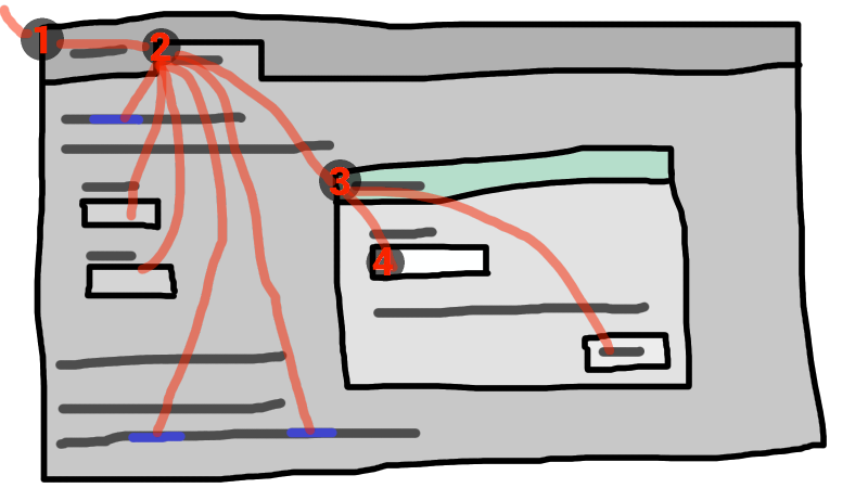
If the widget with focus in this example was the text control in the dialog box, then key input would be channeled from the graphical system to ① the web browser, then to ② the tab, then to ③ the dialog, and finally to ④ the text control.
Keyboard events are always targeted at this focused element.
The term focusable area is used to refer to regions of the interface that can become the target of keyboard input. Focusable areas can be elements, parts of elements, or other regions managed by the user agent.
Each focusable area has a DOM anchor, which is a Node object
that represents the position of the focusable area in the DOM. (When the focusable
area is itself a Node, it is its own DOM anchor.) The DOM anchor is
used in some APIs as a substitute for the focusable area when there is no other DOM object
to represent the focusable area.
The following table describes what objects can be focusable areas. The cells in the left column describe objects that can be focusable areas; the cells in the right column describe the DOM anchors for those elements. (The cells that span both columns are non-normative examples.)
| Focusable area | DOM anchor |
|---|---|
| Examples | |
Elements that meet all the following criteria:
| The element itself. |
|
| |
The shapes of area elements in an image map associated with an
img element that is being rendered and is not expressly
inert.
|
The img element.
|
|
In the following example, the | |
| The user-agent provided subwidgets of elements that are being rendered and are not actually disabled or expressly inert. | The element for which the focusable area is a subwidget. |
|
The controls in the user
interface for a | |
| The scrollable regions of elements that are being rendered and are not expressly inert. | The element for which the box that the scrollable region scrolls was created. |
|
The CSS 'overflow' property's 'scroll' value typically creates a scrollable region. | |
The viewport of a Document that has a non-null browsing context and is not inert.
|
The Document for which the viewport was created.
|
|
The contents of an | |
| Any other element or part of an element determined by the user agent to be a focusable area, especially to aid with accessibility or to better match platform conventions. | The element. |
|
A user agent could make all list item bullets sequentially focusable, so that a user can more easily navigate lists. Similarly, a user agent could make all elements with | |
A browsing context container (e.g. an
iframe) is a focusable area, but key events routed to a browsing
context container get immediately routed to its nested browsing context's
active document. Similarly, in sequential focus navigation a browsing context
container essentially acts merely as a placeholder for its nested browsing
context's active document.
One focusable area in each Document is designated the focused
area of the document. Which control is so designated changes over time, based on algorithms
in this specification.
The currently focused area of a top-level browsing context topLevelBC at any particular time is the focusable area returned by this algorithm:
Let candidate be topLevelBC's active document.
While candidate's focused area is a browsing context container with a non-null nested browsing context: set candidate to the active document of that browsing context container's nested browsing context.
If candidate's focused area is non-null, set candidate to candidate's focused area.
Return candidate.
An element that is the DOM anchor of a focusable area is said to gain focus when that focusable area becomes the currently focused area of a top-level browsing context. When an element is the DOM anchor of a focusable area of the currently focused area of a top-level browsing context, it is focused.
tabindex attributeSupport in all current engines.
The tabindex
content attribute allows authors to make an element and regions that have the element as its
DOM anchor be focusable areas, allow or prevent
them from being sequentially focusable, and determine their relative ordering for
sequential focus navigation.
The name "tab index" comes from the common use of the Tab key to navigate through the focusable elements. The term "tabbing" refers to moving forward through sequentially focusable focusable areas.
The tabindex attribute, if specified, must have a value
that is a valid integer. Positive numbers specify the relative position of the
element's focusable areas in the sequential focus
navigation order, and negative numbers indicate that the control is not
sequentially focusable.
Developers should use caution when using values other than 0 or −1 for their tabindex attributes as this is complicated to do correctly.
The following provides a summary of the behaviors of the
possible tabindex attribute values.
tabindex attribute value come later.Note that the tabindex attribute cannot be used to make
an element non-focusable. The only way a page author can do that is by disabling the element, or making it
inert.
activeElementReturns the deepest element in the document through which or to which key events are being routed. This is, roughly speaking, the focused element in the document.
For the purposes of this API, when a child browsing context is focused, its
container is focused
in the parent browsing context. For example, if the user moves the focus to a text
control in an iframe, the iframe is the element returned by the activeElement API in the
iframe's node document.
Similarly, when the focused element is in a different node tree than documentOrShadowRoot, the element returned will be the host that's located in the same node tree as documentOrShadowRoot if documentOrShadowRoot is a shadow-including inclusive ancestor of the focused element, and null if not.
hasFocus()Support in all current engines.
Returns true if key events are being routed through or to the document; otherwise, returns false. Roughly speaking, this corresponds to the document, or a document nested inside this one, being focused.
focus()Support in all current engines.
Moves the focus to the window's browsing context, if any.
focus([ { preventScroll: true } ])Support in all current engines.
Moves the focus to the element.
If the element is a browsing context container, moves the focus to its nested browsing context instead.
By default, this method also scrolls the element into view. Providing the preventScroll option and setting it to true
prevents this behavior.
blur()Support in all current engines.
Moves the focus to the viewport. Use of this method is discouraged; if you want
to focus the viewport, call the focus() method on
the Document's document element.
Do not use this method to hide the focus ring if you find the focus ring unsightly. Instead, use a CSS rule to override the 'outline' property, and provide a different way to show what element is focused. Be aware that if an alternative focusing style isn't made available, the page will be significantly less usable for people who primarily navigate pages using a keyboard, or those with reduced vision who use focus outlines to help them navigate the page.
For example, to hide the outline from links and instead use a yellow background to indicate focus, you could use:
:link:focus, :visited:focus { outline : none; background : yellow; color : black; } autofocus attributeSupport in all current engines.
The autofocus
content attribute allows the author to indicate that an element is to be focused as soon as the
page is loaded or as soon as the dialog within which it finds itself is shown,
allowing the user to just start typing without having to manually focus the main element.
The autofocus attribute is a boolean
attribute.
An element's nearest ancestor autofocus scoping root element is the element itself
if the element is a dialog element, or else is the element's nearest ancestor
dialog element, if any, or else is the element's last inclusive ancestor
element.
There must not be two elements with the same nearest ancestor autofocus scoping root
element that both have the autofocus attribute
specified.
In the following snippet, the text control would be focused when the document was loaded.
< input maxlength = "256" name = "q" value = "" autofocus >
< input type = "submit" value = "Search" > The autofocus attribute applies to all elements, not
just to form controls. This allows examples such as the following:
< div contenteditable autofocus > Edit < strong > me!</ strong >< div > Each element that can be activated or focused can be assigned a single key combination to
activate it, using the accesskey attribute.
The exact shortcut is determined by the user agent, based on information about the user's
keyboard, what keyboard shortcuts already exist on the platform, and what other shortcuts have
been specified on the page, using the information provided in the accesskey attribute as a guide.
In order to ensure that a relevant keyboard shortcut is available on a wide variety of input
devices, the author can provide a number of alternatives in the accesskey attribute.
Each alternative consists of a single character, such as a letter or digit.
User agents can provide users with a list of the keyboard shortcuts, but authors are encouraged
to do so also. The accessKeyLabel IDL attribute returns a
string representing the actual key combination assigned by the user agent.
In this example, an author has provided a button that can be invoked using a shortcut key. To support full keyboards, the author has provided "C" as a possible key. To support devices equipped only with numeric keypads, the author has provided "1" as another possibly key.
< input type = button value = Collect onclick = "collect()"
accesskey = "C 1" id = c > To tell the user what the shortcut key is, the author has this script here opted to explicitly add the key combination to the button's label:
function addShortcutKeyLabel( button) {
if ( button. accessKeyLabel != '' )
button. value += ' (' + button. accessKeyLabel + ')' ;
}
addShortcutKeyLabel( document. getElementById( 'c' )); Browsers on different platforms will show different labels, even for the same key combination, based on the convention prevalent on that platform. For example, if the key combination is the Control key, the Shift key, and the letter C, a Windows browser might display "Ctrl+Shift+C", whereas a Mac browser might display "^⇧C", while an Emacs browser might just display "C-C". Similarly, if the key combination is the Alt key and the Escape key, Windows might use "Alt+Esc", Mac might use "⌥⎋", and an Emacs browser might use "M-ESC" or "ESC ESC".
In general, therefore, it is unwise to attempt to parse the value returned from the accessKeyLabel IDL attribute.
accesskey
attributeSupport in all current engines.
All HTML elements may have the accesskey
content attribute set. The accesskey attribute's value is used
by the user agent as a guide for creating a keyboard shortcut that activates or focuses the
element.
If specified, the value must be an ordered set of unique space-separated tokens none of which are identical to another token and each of which must be exactly one code point in length.
In the following example, a variety of links are given with access keys so that keyboard users familiar with the site can more quickly navigate to the relevant pages:
< nav >
< p >
< a title = "Consortium Activities" accesskey = "A" href = "/Consortium/activities" > Activities</ a > |
< a title = "Technical Reports and Recommendations" accesskey = "T" href = "/TR/" > Technical Reports</ a > |
< a title = "Alphabetical Site Index" accesskey = "S" href = "/Consortium/siteindex" > Site Index</ a > |
< a title = "About This Site" accesskey = "B" href = "/Consortium/" > About Consortium</ a > |
< a title = "Contact Consortium" accesskey = "C" href = "/Consortium/contact" > Contact</ a >
</ p >
</ nav > In the following example, the search field is given two possible access keys, "s" and "0" (in that order). A user agent on a device with a full keyboard might pick Ctrl+Alt+S as the shortcut key, while a user agent on a small device with just a numeric keypad might pick just the plain unadorned key 0:
< form action = "/search" >
< label > Search: < input type = "search" name = "q" accesskey = "s 0" ></ label >
< input type = "submit" >
</ form > In the following example, a button has possible access keys described. A script then tries to update the button's label to advertise the key combination the user agent selected.
< input type = submit accesskey = "N @ 1" value = "Compose" >
...
< script >
function labelButton( button) {
if ( button. accessKeyLabel)
button. value += ' (' + button. accessKeyLabel + ')' ;
}
var inputs = document. getElementsByTagName( 'input' );
for ( var i = 0 ; i < inputs. length; i += 1 ) {
if ( inputs[ i]. type == "submit" )
labelButton( inputs[ i]);
}
</ script > On one user agent, the button's label might become "Compose (⌘N)". On another, it might become "Compose (Alt+⇧+1)". If the user agent doesn't assign a key, it will be just "Compose". The exact string depends on what the assigned access key is, and on how the user agent represents that key combination.
contenteditable content attributeSupport in all current engines.
Global_attributes/contenteditable
Support in all current engines.
The contenteditable content attribute is an
enumerated attribute whose keywords are the empty string, true, and false. The empty string and the true keyword map to the true state. The false
keyword maps to the false state. In addition, there is a third state, the inherit
state, which is the missing value default and the invalid value default.
The true state indicates that the element is editable. The inherit state indicates that the element is editable if its parent is. The false state indicates that the element is not editable.
For example, consider a page that has a form and a textarea to
publish a new article, where the user is expected to write the article using HTML:
< form method = POST >
< fieldset >
< legend > New article</ legend >
< textarea name = article > < p>Hello world.< /p></ textarea >
</ fieldset >
< p >< button > Publish</ button ></ p >
</ form > When scripting is enabled, the textarea element could be replaced with a rich
text control instead, using the contenteditable
attribute:
< form method = POST >
< fieldset >
< legend > New article</ legend >
< textarea id = textarea name = article > < p>Hello world.< /p></ textarea >
< div id = div style = "white-space: pre-wrap" hidden >< p > Hello world.</ p ></ div >
< script >
let textarea = document. getElementById( "textarea" );
let div = document. getElementById( "div" );
textarea. hidden = true ;
div. hidden = false ;
div. contentEditable = "true" ;
div. oninput = ( e) => {
textarea. value = div. innerHTML;
};
</ script >
</ fieldset >
< p >< button > Publish</ button ></ p >
</ form > Features to enable, e.g., inserting links, can be implemented using the document.execCommand() API, or using
Selection APIs and other DOM APIs. [EXECCOMMAND] [SELECTION] [DOM]
The contenteditable attribute can also be used to
great effect:
<!doctype html>
< html lang = en >
< title > Live CSS editing!</ title >
< style style = white-space:pre contenteditable >
html { margin : .2 em ; font-size : 2 em ; color : lime ; background : purple }
head , title , style { display : block }
body { display : none }
</ style > contentEditable [ = value ]Returns "true", "false", or "inherit", based on the state of the contenteditable attribute.
Can be set, to change that state.
Throws a "SyntaxError" DOMException if the new value
isn't one of those strings.
isContentEditableSupport in all current engines.
Returns true if the element is editable; otherwise, returns false.
designMode getter and setterSupport in all current engines.
designMode [ = value ]Returns "on" if the document is editable, and "off" if it isn't.
Can be set, to change the document's current state. This focuses the document and resets the selection in that document.
Authors are encouraged to set the 'white-space' property on editing hosts and on markup that was originally created through these editing mechanisms to the value 'pre-wrap'. Default HTML whitespace handling is not well suited to WYSIWYG editing, and line wrapping will not work correctly in some corner cases if 'white-space' is left at its default value.
As an example of problems that occur if the default 'normal' value is used instead, consider the case of the user typing "yellow␣␣ball", with two spaces (here represented by "␣") between the words. With the editing rules in place for the default value of 'white-space' ('normal'), the resulting markup will either consist of "yellow ball" or "yellow ball"; i.e., there will be a non-breaking space between the two words in addition to the regular space. This is necessary because the 'normal' value for 'white-space' requires adjacent regular spaces to be collapsed together.
In the former case, "yellow⍽" might wrap to the next line ("⍽" being used here to represent a non-breaking space) even though "yellow" alone might fit at the end of the line; in the latter case, "⍽ball", if wrapped to the start of the line, would have visible indentation from the non-breaking space.
When 'white-space' is set to 'pre-wrap', however, the editing rules will instead simply put two regular spaces between the words, and should the two words be split at the end of a line, the spaces would be neatly removed from the rendering.
Support in all current engines.
The spellcheck
attribute is an enumerated attribute whose keywords are the empty string, true and false. The empty string and the true keyword map to the true state. The false
keyword maps to the false state. In addition, there is a third state, the default
state, which is the missing value default and the invalid value default.
The true state indicates that the element is to have its spelling and
grammar checked. The default state indicates that the element is to act according to a
default behavior, possibly based on the parent element's own spellcheck state, as defined below. The false state
indicates that the element is not to be checked.
spellcheck [ = value ]Returns true if the element is to have its spelling and grammar checked; otherwise, returns false.
Can be set, to override the default and set the spellcheck content attribute.
This specification does not define the user interface for spelling and grammar checkers. A user agent could offer on-demand checking, could perform continuous checking while the checking is enabled, or could use other interfaces.
Global_attributes/autocapitalize
Some methods of entering text, for example virtual keyboards on mobile devices, and also voice
input, often assist users by automatically capitalizing the first letter of sentences (when
composing text in a language with this convention). A virtual keyboard that implements
autocapitalization might automatically switch to showing uppercase letters (but allow the user to
toggle it back to lowercase) when a letter that should be autocapitalized is about to be typed.
Other types of input, for example voice input, may perform autocapitalization in a way that does
not give users an option to intervene first. The autocapitalize attribute allows authors to control such
behavior.
The autocapitalize attribute, as typically
implemented, does not affect behavior when typing on a physical keyboard. (For this reason, as
well as the ability for users to override the autocapitalization behavior in some cases or edit
the text after initial input, the attribute must not be relied on for any sort of input
validation.)
The autocapitalize attribute can be used on an editing host to control autocapitalization behavior for the hosted
editable region, on an input or textarea element to control the behavior
for inputting text into that element, or on a form element to control the default
behavior for all autocapitalize-inheriting elements
associated with the form element.
The autocapitalize attribute never causes
autocapitalization to be enabled for input elements whose type attribute is in one of the URL, Email, or Password states.
The autocapitalization processing model is based on selecting among five autocapitalization hints, defined as follows:
The user agent and input method should use make their own determination of whether or not to enable autocapitalization.
No autocapitalization should be applied (all letters should default to lowercase).
The first letter of each sentence should default to a capital letter; all other letters should default to lowercase.
The first letter of each word should default to a capital letter; all other letters should default to lowercase.
All letters should default to uppercase.
The autocapitalize attribute is an enumerated
attribute whose states are the possible autocapitalization hints. The autocapitalization hint specified by the
attribute's state combines with other considerations to form the used autocapitalization
hint, which informs the behavior of the user agent. The keywords for this attribute and
their state mappings are as follows:
| Keyword | State |
|---|---|
off
| none |
none
| |
on
| sentences |
sentences
| |
words
| words |
characters
| characters |
The invalid value default is the sentences state. The missing value default is the default state.
autocapitalize [ = value ]Returns the current autocapitalization state for the element, or an empty string if it hasn't
been set. Note that for input and textarea elements that inherit their
state from a form element, this will return the autocapitalization state of the
form element, but for an element in an editable region, this will not return the
autocapitalization state of the editing host (unless this element is, in fact, the editing
host).
Can be set, to set the autocapitalize content
attribute (and thereby change the autocapitalization behavior for the element).
inputmode attributeSupport in all current engines.
User agents can support the inputmode attribute on form
controls (such as the value of textarea elements), or in elements in an editing
host (e.g., using contenteditable).
The inputmode
content attribute is an enumerated attribute that specifies what kind of input
mechanism would be most helpful for users entering content.
| Keyword | Description |
|---|---|
none
| The user agent should not display a virtual keyboard. This keyword is useful for content that renders its own keyboard control. |
text
| The user agent should display a virtual keyboard capable of text input in the user's locale. |
tel
| The user agent should display a virtual keyboard capable of telephone number input. This should including keys for the digits 0 to 9, the "#" character, and the "*" character. In some locales, this can also include alphabetic mnemonic labels (e.g., in the US, the key labeled "2" is historically also labeled with the letters A, B, and C). |
url
| The user agent should display a virtual keyboard capable of text input in the user's locale, with keys for aiding in the input of URLs, such as that for the "/" and "." characters and for quick input of strings commonly found in domain names such as "www." or ".com". |
email
| The user agent should display a virtual keyboard capable of text input in the user's locale, with keys for aiding in the input of email addresses, such as that for the "@" character and the "." character. |
numeric
| The user agent should display a virtual keyboard capable of numeric input. This keyword is useful for PIN entry. |
decimal
| The user agent should display a virtual keyboard capable of fractional numeric input. Numeric keys and the format separator for the locale should be shown. |
search
| The user agent should display a virtual keyboard optimized for search. |
enterkeyhint
attributeUser agents can support the enterkeyhint
attribute on form controls (such as the value of textarea elements), or in elements
in an editing host (e.g., using contenteditable).
The enterkeyhint content attribute is an enumerated
attribute that specifies what action label (or icon) to present for the enter key on
virtual keyboards. This allows authors to customize the presentation of the enter key in order to
make it more helpful for users.
| Keyword | Description |
|---|---|
enter
| The user agent should present a cue for the operation 'enter', typically inserting a new line. |
done
| The user agent should present a cue for the operation 'done', typically meaning there is nothing more to input and the input method editor (IME) will be closed. |
go
| The user agent should present a cue for the operation 'go', typically meaning to take the user to the target of the text they typed. |
next
| The user agent should present a cue for the operation 'next', typically taking the user to the next field that will accept text. |
previous
| The user agent should present a cue for the operation 'previous', typically taking the user to the previous field that will accept text. |
search
| The user agent should present a cue for the operation 'search', typically taking the user to the results of searching for the text they have typed. |
send
| The user agent should present a cue for the operation 'send', typically delivering the text to its target. |
This section defines find-in-page — a common user-agent mechanism which allows users to search through the contents of the page for particular information.
Access to find-in-page feature is provided via a find-in-page interface. This is a user-agent provided user interface, which allows the user to specify input and the parameters of the search. This interface can appear as a result of a shortcut or a menu selection.
A combination of text input and settings in the find-in-page interface represents the user query. This typically includes the text that the user wants to search for, as well as optional settings (e.g., the ability to restrict the search to whole words only).
The user-agent processes page contents for a given query, and identifies zero or more matches, which are content ranges that satisfy the user query.
One of the matches is identified to the user as the active match. It is highlighted and scrolled into view. The user can navigate through the matches by advancing the active match using the find-in-page interface.
Issue #3539 tracks
standardizing how find-in-page underlies the currently-unspecified window.find() API.
The find-in-page process is invoked in the context of a document, and may have an effect on the selection of that document. Specifically, the range that defines the active match can dictate the current selection. These selection updates, however, can happen at different times during the find-in-page process (e.g. upon the find-in-page interface dismissal or upon a change in the active match range).